Wednesday, May 20, 2015

New Technique!

I have the last three commissions here, and I have been working on them on and off the last couple weeks. As a new-ish artist, I am always discovering new techniques and ways to improve my work.

This "new technique" is one I have never heard of, or seen anyone else use before. It came about from a reference picture of a hoof. The hoof was a shell color with very fine brown lines, some stripes, and a pronounced cornet band. It was exactly what I wanted for this commission. Unfortunately, I have yet to find a small enough brush to get those brown lines fine enough. Perhaps I should just cut a bristle off one of my brushes and use that!

That, however, would take absolute ages, and many mistakes before getting right. There is so much more room for error in that way.

Instead, I remembered way back to when I accidentally used a wet flat brush with pigments. The pigments were very fine and made more brush strokes than regular acrylic paints. Of course, at that time, that is exactly what I did NOT want!

I wanted exactly that for my hooves though! I used a small (size 3 I believe) cheap, flat, Golden Taklon brush with somewhat firm bristles. I first dipped it into my cup of water, dabbed it on a paper towel to remove a majority of the water, and they flicked out the bristles with my finger. This separated all the bristles and got the rest of the extra water off. I then dusted the top of my pigment jar with the desired pigment color, and dipped the tip of the bristles in the pigment so only the very ends of the bristles had a tiny bit of pigment. Because the brush was still a bit went, the pigments became more of a paste than a powder. I then brushed this on in the direction of the hoof, from top to bottom. It created very thin lines in a diluted version of the pigment color, becoming darker on some lines and lighter on others. A nice variety! I didn't do any horizontal stripes, I thought it would look too busy and "over done". If you water down the pigments even more, you might be able to add some horizontal growth lines without it looking over-done. Or, you could only do horizontal stripes! I guess it just depends on the reference and look you are trying to achieve.
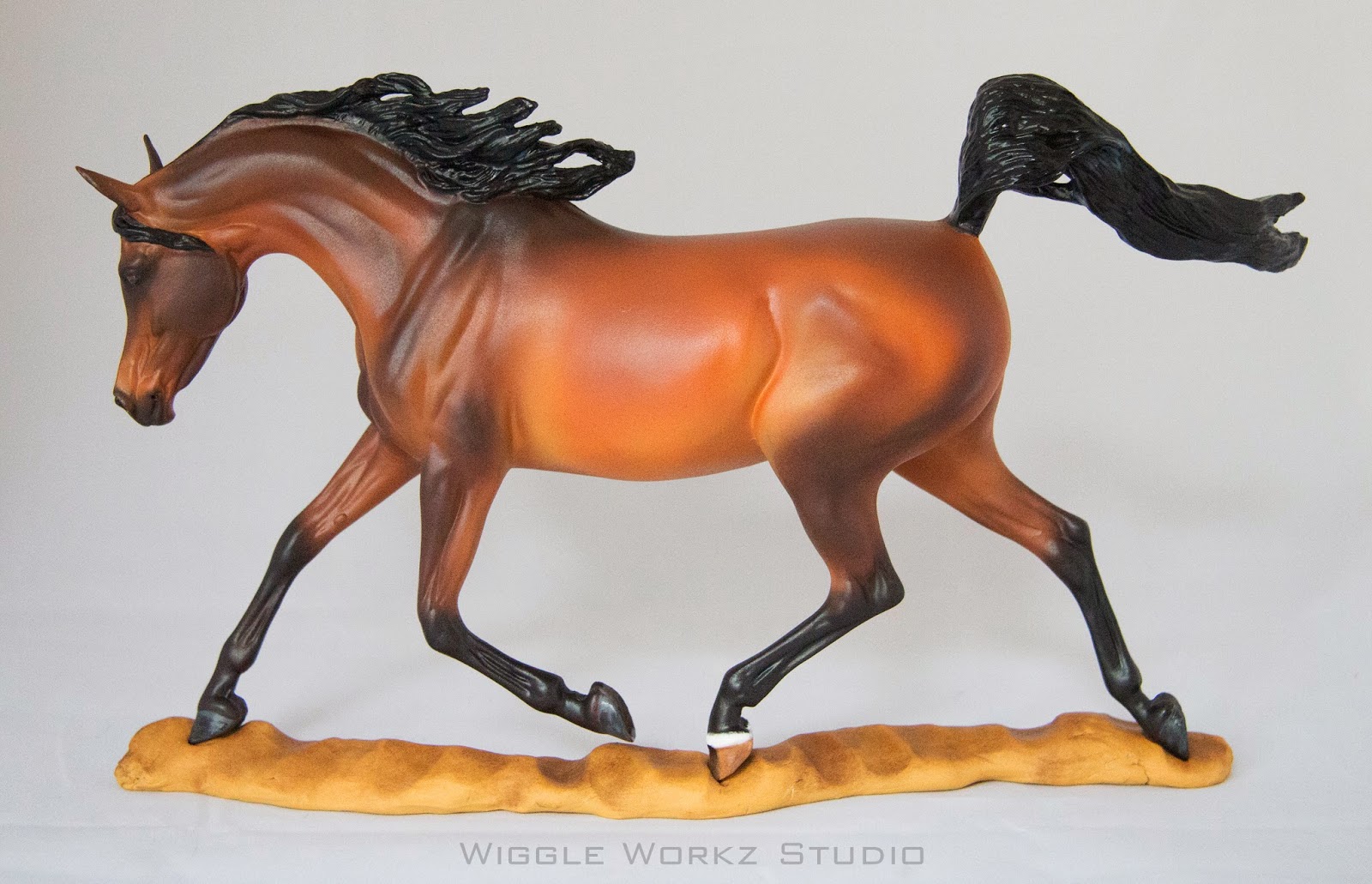
This is the result:


(Excuse the uneven hooves, the surface he is on it not flat!)

He would look fabulous with metal horse shows, but that's not part of the order. He is a fancy barefoot warmblood! He will get his touch-ups and the rest of his details later today. Definitely one of the snazziest I've done!

Sunday, May 10, 2015

Another Custom!

Well, there have been quite a few Gilen customs jumping out of my studio lately. I thought it might be a fun post to share my difficulties with the latest. It is one of my favorite molds to paint. It is smooth and everything is well defined. I always find the off-side eye a bit wonky, its not shaped perfectly. To remedy that, I have to look at quite a few references to make sure I'm not painting the eye slanted. It takes a bit of trial-and-error, but eventually it works out.

My most recent Gilen custom is a light buttermilk buckskin pinto. This color was slightly challenging. I usually have a tendency to go darker to add more shading. I wanted this color to be vibrant but pale. The base coat and first layer of shading were airbrushed to give it a very subtle look. It was dark enough, but still had color. I used a very light tan with a lot of white to get the base coat how I wanted it. My main concern was that it would look too white. Thankfully I have worked with my airbrush colors enough to know when they dry, they are usually one shade darker and not as vibrant. I cannot always rely on how it looks in the airbrush cup. It can VERY misleading and result in a color that is far from what I had been hoping for.

The next challenge with this color was adding some real color, such as yellows and red-browns, without making them over powering. I feel I accomplished this by using Earth Pigments and a big fluffy brush. I picked a big fluffy brush for a couple reasons. One, they don't hold much pigment if you tap them out well. Sometimes, it all comes out and you're left with an empty brush! Secondly, it blends the color better, and gives it a softer look. This makes it easier to add a slight area of color without really noticing it. It just blends in with the piece as a whole. Choosing the color to define the muscles was hard. I didn't want this guy to be incredibly yellow, my reference wasn't a banana, canary...you get the point. I chose Cyprus Umber Warm and Natural Sienna mostly due to the red and orange tones. These colors tied the piece together, gave it some interest, and didn't overpower the buttermilk color I was going for.

That was about it for the challenging aspects of this custom. I really like the color overall, it's soft and appealing to me. I know I will be painting this color again!


Sunday, May 3, 2015

A Few New Pieces

I have been very busy in the studio and will be finishing pieces left and right until BreyerFest. Here are a couple that I have recently finished:


Breyer Weathergirl to a bright bay


Breyer Totilas to a dark gold champagne


Feurte sculptured by Josine Vingerling to a medium red chestnut


Bust-A-Move Hackney Stallion to a dark shaded bay


Breyer Marwari to a bay sabino

Golden Palomino Gilen